

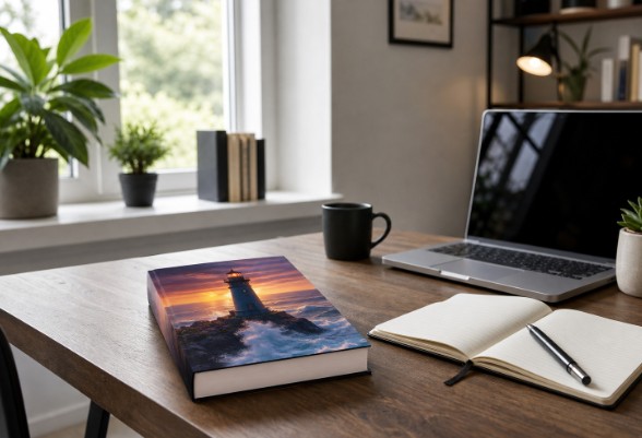
Why Book Mockups Matter
A cover is often the first piece of a book campaign that prospective readers notice. A well-made book mockup gives the design physical presence by placing it on a desk, in a reader’s hands, beside a chair, or against a clean background. That added context can make a digital cover feel more tangible, polished, and ready to buy. Mockups are not a replacement for a strong cover. They are a presentation tool that helps the approved design perform across storefronts, social posts, author websites, and email campaigns. The best versions focus attention on the title, author name, and central image rather than competing with them. A cover has always done more than protect pages. It also communicates subject, style, and market position, which is why book covers help identify and promote books online as well as on physical shelves. A mockup extends that role by showing readers how the cover might fit into their own reading life.
What A Mockup Can Show
- The front cover is in a believable, visually appealing setting.
- The trim size, thickness, spine, and overall format of a print edition.
- How the cover looks next to everyday objects without being obscured.
- How front, back, and spine artwork work together on a full wraparound design.
- Whether the visual identity holds up in promotional formats.
Start With Reader-First Design
Before choosing a scene, think about the person most likely to read the book. A mockup should make it easier for the reader to understand what kind of experience the book offers. Genre signals matter because they reduce uncertainty during a quick scroll. Book designers balance type, image, color, and audience expectations when shaping a cover, as shown in this discussion of how cover designers use typography and imagery. Authors can apply the same thinking to mockups by treating the setting as a supporting part of the visual message.
Ask Three Basic Questions
- Can a new reader identify the genre at a glance?
- Can the title still be read on a small phone screen?
- Does the mood feel consistent with the story, topic, and audience?
A practical business guide may fit naturally in a bright workspace with a notebook and a laptop. A literary novel may suit a softer light and a quiet reading chair. A thriller can use selective shadows and restrained props to create tension. The point is not to follow a rigid formula. It is to make a setting that supports the promise of the cover.
Choose Settings That Fit The Book
Every background communicates something before a reader consciously notices it. A sunlit table can suggest warmth and accessibility. A stark studio background can feel premium and direct. A cluttered room can make a carefully designed cover feel less important, even if the book itself is excellent.
Useful Setting Ideas
- Desk scene: Useful for business, career, productivity, academic, and self-help titles.
- Reading chair: A natural fit for fiction, memoir, poetry, and lifestyle books.
- Bookshelf: Helpful for series pages, author sites, and collection announcements.
- Outdoor setting: Suitable for travel, nature, wellness, adventure, and regional topics.
- Plain background: Ideal when the typography or illustration needs undivided attention.
Keep props intentional. A single pair of glasses, a bookmark, or a cup may add scale and atmosphere. Ten unrelated objects usually add visual noise. If a prop does not improve genre recognition, balance, or storytelling, remove it.
Test Every Cover At Thumbnail Size
A mockup that looks impressive on a large monitor can fail when it appears as a tiny store listing or mobile social preview. Shrink the image until the book is approximately the size readers will encounter in search results. If the title becomes hard to decipher, the composition needs adjustment.
Check These Details
- Title and subtitle readability.
- Author name clarity.
- Contrast between important text and its background.
- Visibility of the main cover image or visual symbol.
- Whether surrounding objects overpower the book.
Try the image with a square, vertical, and wide crop before finalizing it. This simple test reveals whether the book remains the focal point or disappears once a platform trims the edges.
Use Mockups Across The Content Plan
One strong scene can produce a consistent set of campaign assets. Rather than creating a new visual identity for every channel, build a few complementary mockups and crop them for their intended use.
- Launch announcements and preorder reminders.
- Website headers, landing pages, and author biography pages.
- Email newsletter banners and reader updates.
- Retailer graphics, giveaway posts, and event materials.
- Press kits, interview announcements, and media pages.
Avoid Common Mockup Mistakes
Adding Too Many Props
Extra objects can hide the title, confuse the message, or make the scene feel staged. Use negative space generously so the cover has room to command attention.
Using The Wrong Perspective
A bent spine, warped lettering, a floating shadow, or an impossible angle can undermine credibility. Check that the book’s dimensions, page edges, lighting, and shadow all look physically believable.
Changing Cover Details
Mockups must use the final approved artwork. Review the title, byline, subtitle, colors, spine text, and any series branding against the master cover file before publication.
Ignoring Genre Signals
A visually attractive setting can still send the wrong message. A playful pastel scene may not support a serious legal guide, and a dark, dramatic scene may confuse readers of a cheerful parenting book.
Build A Simple Mockup Workflow
- Gather final files. Use approved front, back, and spine artwork where applicable.
- List every planned use. Identify website, email, social, retailer, and press needs.
- Select suitable settings. Match each scene to the audience and genre.
- Create multiple crops. Prepare wide, square, and vertical variations.
- Test at small sizes. Confirm that readers can still recognize the book.
- Review technical accuracy. Compare each mockup with the final cover.
- Export organized files. Name versions clearly by platform and dimensions.
Final Checklist Before Publishing
- Is the title readable at thumbnail size?
- Does the scene match the genre and audience?
- Does every cover detail match the approved artwork?
- Is the book clearly the focal point?
- Are shadows, edges, and perspective believable?
- Do the colors fit the broader campaign?
- Is the file sized correctly for its destination?
Conclusion
Book cover mockups work best when they have a clear purpose rather than simply making a cover look attractive. They should help readers notice the design, understand the book’s genre and promise, and remember it later. Choose a setting that supports the story without distracting from the cover, and make sure the title and author name remain readable at different sizes. A strong original cover, fitting background, realistic lighting, natural perspective, and careful thumbnail testing can make the mockup feel polished and believable. Create a few useful variations for websites, social media, promotional materials, and launch campaigns, rather than producing countless unrelated scenes. With a consistent design direction and a reliable review process, a single book cover can become a versatile visual asset at every stage of a book launch.

