

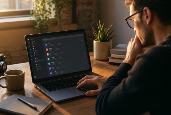
A notification center is not simply a place to store product events. It is a decision-making tool that helps people separate urgent work from background activity. Reviewing notification bell patterns can inspire interface ideas, but the icon is only the entry point. The real experience begins when users open the feed and need to understand what changed.
The best notification centers reduce mental effort. Instead of pushing every event into a long, noisy list, they make relevant updates easy to scan, prioritize, and complete. A user should be able to answer three questions quickly: What happened? Does it need my attention? Where do I go next?
Start With the Right Notification Goal
A useful center supports meaningful work, not engagement for its own sake. A request for approval, a failed payment, or a security warning may require immediate attention. A teammate viewing a document or liking a comment usually does not. Treating both events with equal visual weight teaches users to ignore the system.
Classify Messages by User Need
- Action: The user must approve, reply, review, assign, or fix something.
- Information: A status change, but no response is required.
- Reminder: A deadline, expiring item, or unfinished task needs a timely prompt.
- Warning: A risk, error, failed process, or account issue needs attention.
Each category deserves a different level of interruption. Routine updates can stay in the in-product feed, while a time-sensitive account problem may warrant a push or email alert. Apple’s guidance on notification interruption levels offers a useful principle: match the level of disruption to the message’s value and urgency.
Write Messages Users Can Scan
Use a compact structure: actor, action, object, and time. Put the information that changes the user’s next step first, then keep the secondary context visually quieter. Plain verbs are stronger than generic labels.
- Weak: “You have a new update.”
- Better: “Jordan asked you to review the launch plan.”
- Weak: “Action required.”
- Better: “Your export failed because the source file is missing.”
Distinguish new, unread, read, saved, and completed states rather than using one vague indicator for everything. A small dot, subtle background tint, or bold title can indicate unread content. Reserve number badges for counts that genuinely help users prioritize. Hide the badge when nothing is new, and make “Mark all as read” quick, clear, and reversible when practical.
Reduce Feed Clutter Before Adding More Controls
Repeated events should be grouped when they describe the same underlying activity. Ten separate reactions on one post can become “10 people reacted to your update.” A project with several status changes might show a summary with the most recent change and an option to expand the history.
Group by source, project, event type, or short time window, but do not combine items that require individual responses. If three approval requests each require a separate decision, users should still be able to identify and open each request without having to hunt through a summary.
Link to the Exact Context
Every actionable notification should open the exact comment, task, file, review panel, or account setting involved. Sending users to a generic dashboard creates extra work and breaks the connection between the alert and the action. Use labels such as “Review request,” “Open comment,” or “Fix upload,” rather than a vague “View.” Preserve relevant context after the click, including the selected project, thread, or filter.
Choose a Layout That Fits the Work
- Popover panel: Best for quick checks, low-volume feeds, and simple actions.
- Full-page inbox: Best for high-volume workflows, detailed filters, search, and longer review history.
- Inline updates: Best when an event belongs inside a document, task, conversation, or workflow already on screen.
Offer only the filters people use most often, such as Unread, Assigned to me, Mentions, Project, and Date. Use language that reflects the customer’s work, keep popular filters visible, and provide a one-step way to clear selections. An honest empty state is better than making users wonder whether the filter failed.
Make the Entire Journey Accessible
Accessibility is more than labeling the bell icon. The trigger needs a clear, accessible name, and assistive technology must receive the current unread count and expanded state. The WCAG 2.2 guidelines are a practical reference for testing names, states, keyboard access, contrast, reflow, focus visibility, and status messages.
- Allow keyboard users to open, close, filter, and select notifications without a mouse.
- Keep focus visible and predictable, especially when a panel opens or closes.
- Do not rely on color alone to communicate urgency or unread status.
- Announce new status information without unexpectedly moving focus.
- Give people enough time to read temporary messages before they disappear.
On small screens, a desktop-style dropdown often becomes cramped and difficult to use. Use a full-width panel or dedicated screen when messages need room to wrap, actions need clear tap targets, or users may filter and review a longer history. Test large text settings, long names, narrow devices, and one-handed use.
Give Users Control and Test Real Tasks
Separate essential alerts from optional activity. Let users manage categories, choose digest options for noisy updates, and select sensible delivery channels. Do not use urgent colors or wording to promote routine product news inside a space users trust for important work.
Test the design with realistic tasks: find a review request, locate a failed upload, identify an unread mention, or clear low-priority activity. Measure time to find the right item, time to finish the related task, errors, backtracking, and ignored messages. Include both experienced users and newcomers, because familiarity can hide unclear labels and buried actions.
Measure What Makes Notifications Valuable
Track the time from arrival to view, time from view to completed action, percentage of items that lead to useful action, unread items remaining after a day or week, filter use, mute rates, and task errors. A high bell open rate is not automatically a success. It may mean users feel pressured by a confusing badge and still cannot find anything useful.
Common Mistakes to Avoid
- Showing every system event as if it requires attention.
- Using red or urgent language for routine updates.
- Resetting read status inconsistently across devices.
- Linking notifications to a generic home screen instead of the relevant context.
- Removing older messages without warning or making retention rules unclear.
- Adding complex filters before improving message quality and grouping.
Final Review Checklist
- Can users understand each item at a glance?
- Can they tell which notifications require action?
- Does every useful item lead to the right place?
- Can users control noisy categories and delivery frequency?
- Does the experience work without color, sound, or a mouse?
- Does it remain clear and usable on small screens?
- Can the team prove that notifications help users complete tasks?
A strong notification center earns attention rather than demanding it. When every message is clear, appropriately prioritized, accessible, and connected to a useful next step, the feed becomes a trusted part of the product instead of another source of noise.

